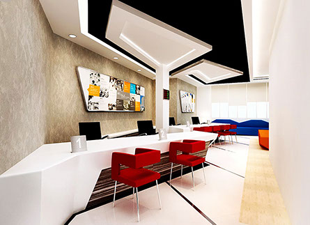
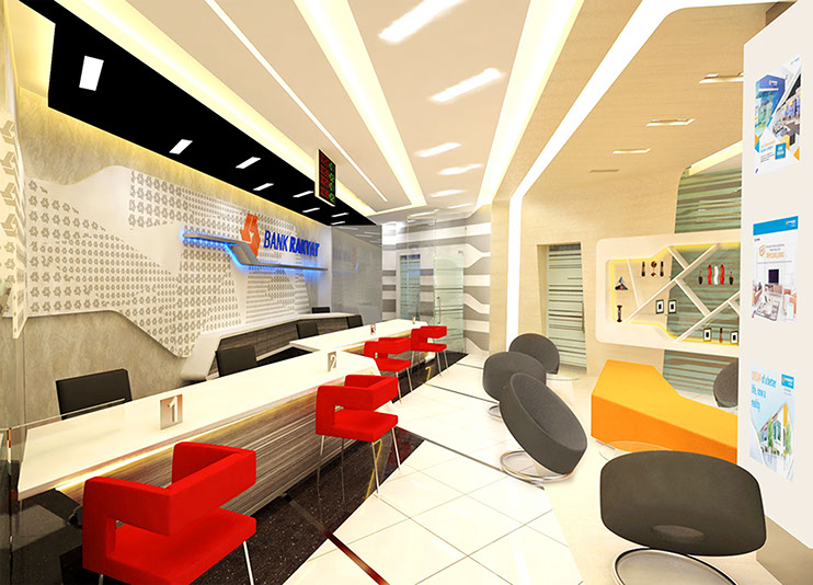
Bank Rakyat has a heavy social responsibility apart from its commercial commitments. The corporate logo of Bank Rakyat was created to express this aspiration which has also greatly influenced the overall design concept for this proposal; both internally and externally.
<< Back to Projects - Offices
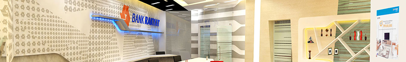
BANK RAKYAT
Refurbishment of multiple branch outlets
DESCRIPTION

Project Details
Client
Location
Cost
Status
Bank Rakyat
Various Locations
RM0.95 mil
Design Proposal
:
:
:
:
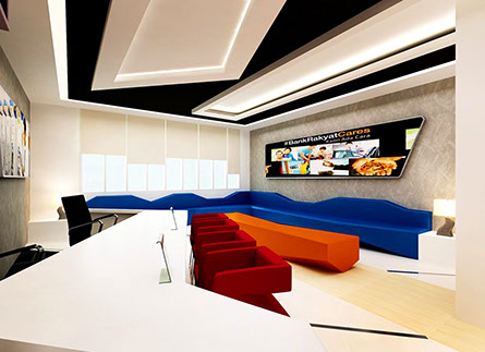
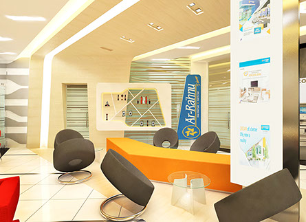
Colour Scheme Concept - Vibrant Cool Tone
“Cool Neutrals” have become much more mid-tone overall resulting in colours with far more personality and presence.
“Blues” are becoming very important and far more varied tone and hue- the major direction is a move towards turquoise, resulting from the influence of green.
“Greens” have taken on the strong yellow influence in every variation from brightest canary to soft mass or deep olive.
“Tangerine” are sunny and direct – much truer shades whether acidic, ochre or gold.
“Reds” are still strong and very influential but a big decrease in the importance of orange.


<< Back to Projects - Offices
All rights reserved. No part of this publication may be reproduced in any form or by any means without the written permission of the copyright holders.
© Anuar M Interiors 2018
Developed by : nnanuar